The client
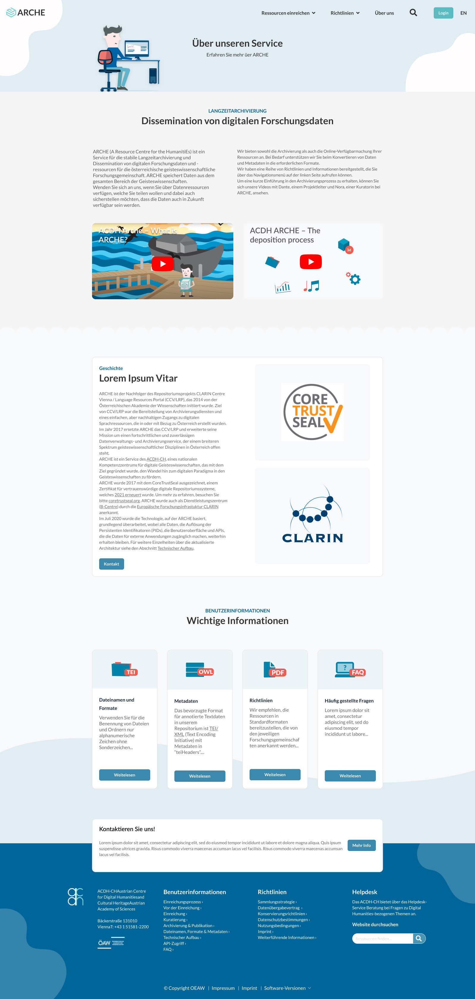
ARCHE (A Resource Centre for the HumanitiEs) is a service that offers stable and persistent hosting as well as the dissemination of digital research data and resources for the Austrian humanities community.
“The new design is simple and describes the complex deposition process for our users accurately. ”
The challenge
The client approached me because they had seen a previous data repository design, which I made for Tethys and wished for something similar. The challenge was to redesign their current repository and make it above all more user-friendly. They had already collected user feedback and were ready to tackle the negative aspects of their interface.
Research & Planning
For this project I opted to do an online suvey with current users. After several internal focus groups with the stakeholders discussing the many questions I had prepared, I decided to send out the survey to around 50 users.
Identified problems
When I collected the survey results it became clear what some of the pain points were. The client had already gathered some user feedback, which matched some of the survey results. It was important to make sure to incorporate all user feedback into the wireframes and thereby creating the base for my high-fidelity designs. Here are some of major pain points:
- Design is outdated.
- Difficulty conveying what ARCHE exactly is.
- Licenses are difficult to identify in the entry.
- The download button is difficult to find.
- The search function is not optimal in terms of UX.
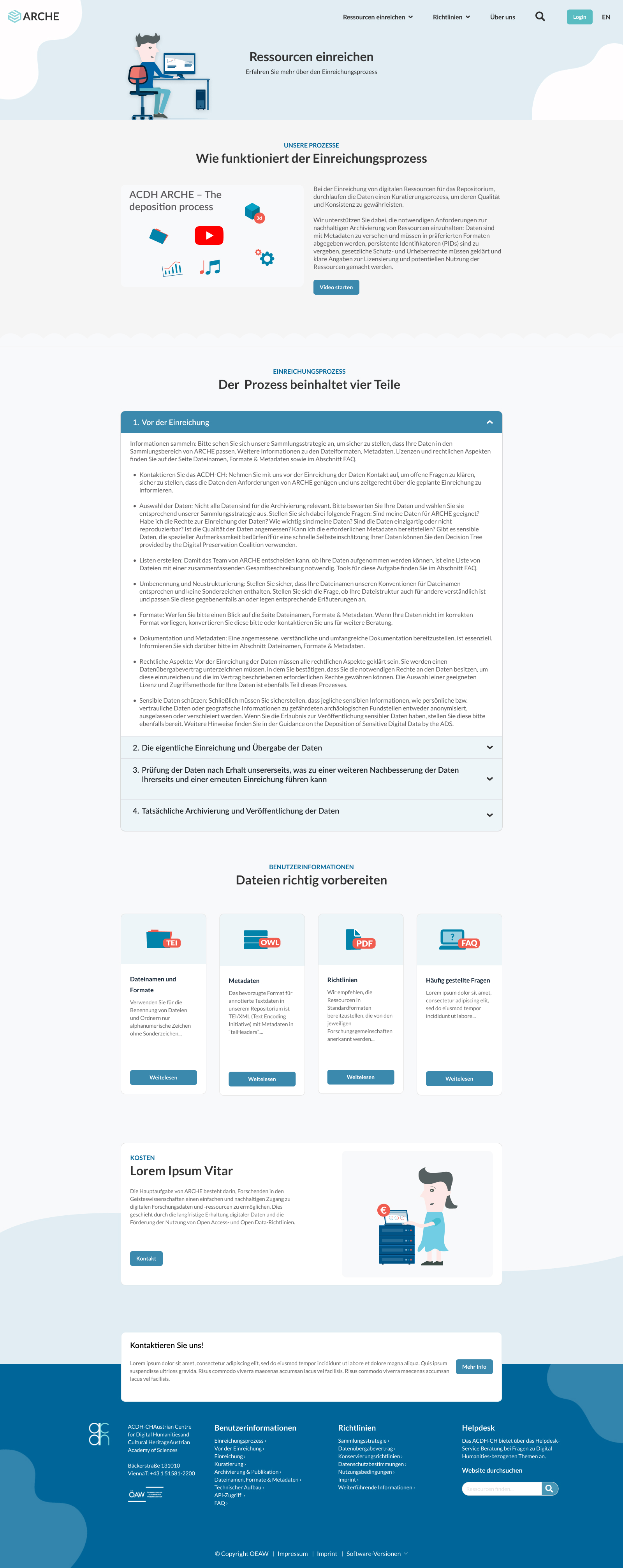
- The instructions for the process are not always understandable.
- Information about costs is not clearly visible.
- Contact options are currently not visible enough.(Contact form?)
- New features are difficult to accommodate.
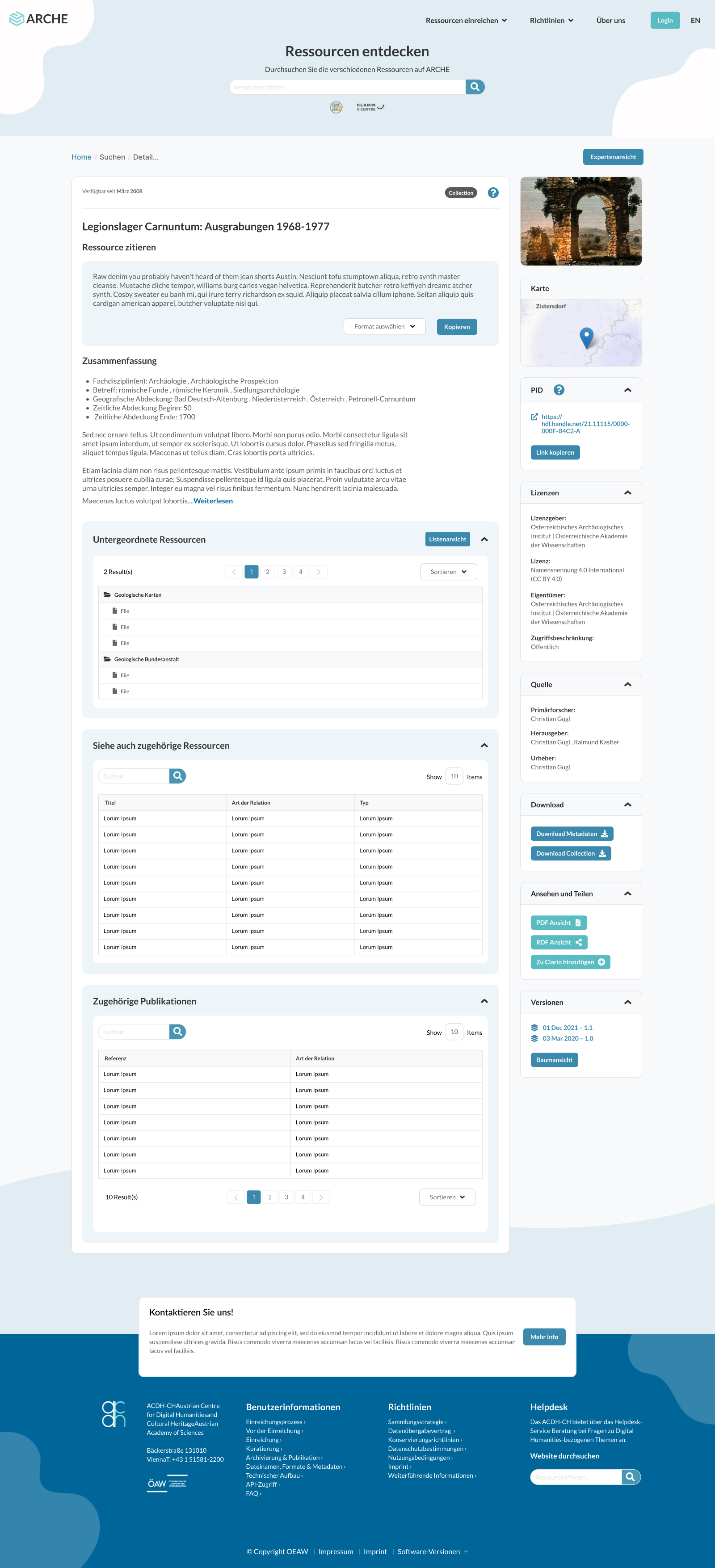
- The quote in the detailed view is not sufficiently visible and requires an explanation.
- It is not easy to navigate through the data collection.
- The detailed view is confusing (too much information).
- It is not clear that “publications” are only ‘metadata’ and not files (resources) for download (“Related Publications & Resources” should be separated to make this clear).
Personas
The data I collected from the research helped me create 2 personas embodying 2 different student types in my target user group.
Designing the solution
Based on my research and focus groups I knew that I needed to design a a platform that offered a clear structure around the services they offer, the data submission process and imporoved data detail views. From the analytics it became apparent that the platform caters to mainly desktop users so the focus would be a on a desktop first application with mobile capabilities. I then sat down created multiple wireframes, which I discussed with the client in their headquaters in Vienna to incorporate the new structure and features based on user feedback.
Wireframes

Final Designs

Search pages


Sub pages
Summary
One of the things worth highlighting was the good cooperation with the client and the entire team from PMs to developers. The client took a keen interest in the design process and through various in house focus groups we came a up with a concept that centered around their typical user as well as their corporate identity and design ambitions.